REMO REMO DESIGN
Cart 0
REMO REMO DESIGN
A graphic design studio specializing in brands and illustration.

Ben’s Best Kosher Pickles

As a new premium pickle company with an owner who’s been in the pickle business for decades, Ben’s Best needed a brand identity and label system to distinguish itself as a brand with all the hallmarks of experience while avoiding the over-used story of a lineage recipe.


BRAND LAUNCH / COLUMBUS, OH
- Logo
- Label system
- Illustration
- Website
- Business cards


Remo-Remo-Design-Bens-Best-Brand.jpg


Ben’s Best wordmark pays homage to the heritage of kosher pickles and delicatessens. We took visual cues from these types of establishments through the choice of color, arching of the name and treatment of the typefaces.


Remo-Remo-Design-Bens-Best-Brand-01.jpg
Bens-Best-Brand-02.jpg


ILLUSTRATION

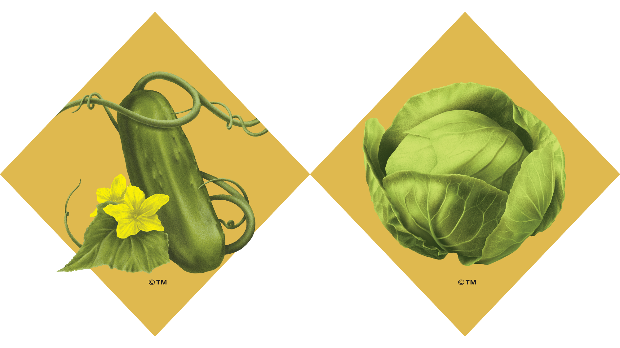
To distinguish Ben’s Best products on the shelves from other jarred pickles, we saw an opportunity to use captivating illustrations when others were not. These illustrations help communicate the craft and expertise that goes into each jar.


Remo-Remo-Design-Bens-Best-Brand-03.png


LABEL SYSTEM

The Ben’s Best brand was created with flexibility, knowing that the business could expand to include other flavors and products. To stand out on shelves, the label shape contrasts with the surrounding rectangle labels.


BensBest-Products-5.jpg